Get Together
Get Together
Singapore's arts scene strongly relies on donations. Get Together encourages patronage of the arts by making it easier to organise outings with multiple people. The app also supports donations directly.
Deliverables
Mobile App

Problem Statement
While nearly half (44%) of people surveyed attended art events to socialise, more than a third (37%) had great difficulty scheduling a common time with friends to do so. The arts heavily relies on donations and grants to survive, yet it is often overlooked by donors. This issue of scheduling conflicts potentially costs a huge loss of revenue for museums, exhibitions and individual artists.
The Product
This app helps make recommendations for cultural events and helps coordinate schedules among friends. As a socially-focused app, the overall goal is to raise appreciation and donations for the Singapore arts scene.
Requirements
Based on extensive research, I found that the app needed 3 main features:
Hassle
A system to reduce the friction of scheduling with multiple people.
Low Awareness
An easy way to review and share photos to increase appreciation for the arts.
Donations
A convenient way to donate to art groups on the app.

Exploring
Gathering Information
To understand the business context and user needs of the product, I carried out the following:
-
2 user surveys with a total of 58 participants from the general public to discover user needs.
-
Competitive analysis of 4 companies' UI, usability and product features to understand business needs.
-
Secondary research to better understand the needs of art groups.
Creating Understanding
To make sense of all the information I had, I did the following:
-
Coded the qualitative survey answers and turned them into quantitive results.
-
Charted the quantitative results.
-
Organised all findings into an affinity map.
-
Formed 3 personas to understand the different user groups' psychological goals and pain points.
-
Made 3 storyboards to better visualise the user's journey.
Research Outcomes
From here, I started generating ideas to solve the problems faced by users. Taking all these into account, it was then time to create the working prototypes and testing with users.
Creating Understanding
Main Findings, Tourists' Motivations, Competitive Analysis


Creating Understanding
Personas, Storyboards, Brainstorming


Iterating
Prototyping
To visualise and test the usability of the web app, I created these prototypes:
-
Sketches to visualise and modify designs.
-
Paper prototypes for a quick usability tests.
-
High-fidelity prototypes for next usability tests. I used Adobe XD.
Usability Testing and Research Outcomes
I conducted usability tests with 5 users. Further below I describe a sample of my design changes.
Low- to Mid-Fidelity Prototypes
Sketches, Paper Prototypes, Wireframes


Wireframing Video
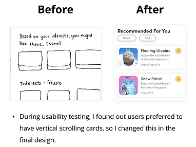
Research Outcomes: Sample of Design Changes


Final Design

Conclusion
Key Takeaways
One major lesson being to always know what your goal is when conducting research. Without knowing your research goal, time can quickly get out of hand. The problem is multi-faceted and much be analysed carefully. Overall, it was truly satisfying to see a solution come to life for such a complex problem.
In Hindsight...
In hindsight, I would consulted UI best practices such as Google's Material Design and Apple's Human Interface Guidelines. This would have prevented me from making mistakes such as having 2 full width buttons stacked on top of each other.